top of page


top
Camlin: Will changing the packaging improve sales for the kids range?
For
Kukuyo Camlin
With
Studio Curious Circle
What
Packaging Design
Scope & Role
Design Research, Packaging Design, Illustrations
At Studio Curious Circle, we conducted a comprehensive packaging redesign driven by in-depth user research. By engaging with key stakeholders- shopkeepers, parents, and children, we gained valuable insights into their preferences, decision-making factors, and the influence each group holds in the purchasing process. This research-led approach enabled us to reimagine the packaging, ensuring it not only meets market needs but also strikes the right balance between functionality and emotional appeal.

Art Safari Kit

Methodology
1. Market and Ecosystem Research
2. Primary Research: Contextual Inquiry
3. Data Analysis and Synthesis
4. Design, Iterate, Execute
5. Primary Research: Contextual Inquiry 2.0
6. Data Analysis and Synthesis 2.0
7. Redesign and Execute


1. Market and Ecosystem Research
We began with secondary research, which helped us understand Camlin's current position in the market against its competitors. Here are some essential insights from this phase.
Doms is very popular. It disrupted a market dominated by legacy brands by excelling in four key areas: product innovation, distinct branding, engaging packaging, and strong distribution.
INSIGHT 1
Mid-range brands like Faber Castell, Nataraj and Apsara dominate the mass market with their affordability and strong presence in educational institutions
INSIGHT 2
Staedtler and maped lead the premium segment with their high-quality, professional grade products, catering primarily to professionals and serious hobbyists.
INSIGHT 3
2. Primary Research: Contextual Inquiry
Understanding the purchasing decisions for stationery brands required engaging with three key stakeholders: shopkeepers, parents, and children.
Questionnaire Development: To delve into their distinct influences. We formulated a tailored questionnaire for each group, reframing and refining the questions through iterative testing to ensure relevance.
Observational Studies: Recognizing that some decision-making factors might be subconscious or unarticulated, we conducted in-situ observations of parent-child interactions within stationery stores. This approach allowed us to capture authentic behaviors and preferences.
3. Data Analysis and Synthesis
CHILDREN
-Children appreciate a fuller-looking pack with multiple elements, making it feel more exciting and engaging.
-Children see the artwork on the pack as a standard for coloring and shading, showing them what they can achieve with the product and inspiring them to try and replicate it.
-The front of the pack must highlight key information, as most children don’t check the back for details.
-Kids are drawn to designs that are colorful with familiar characters or inspired by nature.
-Most children prefer short, crisp information on quantity and shades, relying on artwork to understand the pack’s overall look and feel.
-The Sturdiness of the packaging is crucial for parents since they prefer that children store the product in its original pack.
-Parents want to see the product inside so they can connect its features to its design for example, checking if a pencil’s shape truly is made for better grip or not.
-Kids frequently lose and replace their products, so while parents value quality, they often opt for affordable, easily replaceable options.
PARENTS
-Brand preference in stationery is secondary—buyers usually ask for the product rather than a brand. Shopkeepers influence choices based on margins, popularity, and local school recommendations.
-Shopkeepers prioritize popular brands to avoid dead stock and retain customers, ensuring kids don’t go to another store.
SHOPKEEPRS
What Should Stand Out on the Pack?
Quantity
Overall Look and Feel
Product Img
Pack's Size

40%
35%
15%
10%
Children, Number of Respondents: 40
Quantity
Product Features
Sturdiness of Pack
Brand Name
Product Img

30%
25%
20%
15%
10%
Parents, Number of Respondents: 80
Guiding Principles for the Redesign
For Pack's Artwork
1. Hand-drawn look featuring familiar fictional characters, animals, and elements from nature.
2. Bright and colorful, yet premium and aspirational, creating a sense of getting more than what they paid for.
3. Product Potential: Showcasing unique features and differentiators through expressive artwork.
4. Use of Product Image: Integrating the product image with the artwork to reinforce possibilities.
5. Feature Validation: Demonstrating qualities like smoothness and great shading for easy understanding.
6. Ties to Product Features: Ensuring the artwork aligns with and highlights the product’s key features.
For Pack's Design
Each product needs to have synergy and brand consistency through
1. Brand Name
2. Product Name
3. No.of shades
4. Features & Free Item
5. Product Image
4. Data Analysis and Synthesis
Basis the insights gathered above, we designed packaging for three products, intending to print and test them with children before refining the designs further. The illustrations on the new packs were created by Priya Kurian, Tanya Bhatt, and Sumouli Dutta respectively.
Before
After

Before
After
.jpg)

Before
After
5. Primary Research: Contextual Inquiry 2.0
Alongside the Camlin team, we conducted in-home interviews with 60 households across Mumbai, engaging with children aged 8-14. Our objective was to test the first round of redesigned packaging against the existing Camlin and competitor packaging for individual products. By observing their reactions and gathering direct feedback, we aimed to identify which elements resonated most and which needed further refinement. This research provided key insights that shaped the next phase of design iterations.
6. Data Analysis and Synthesis
1. Familiarity Drives Preference:
Children consistently preferred the old packaging over the new, driven by familiarity with existing designs. This indicated that rather than replacing illustrations entirely, refining and enhancing familiar elements would create a smoother transition while maintaining brand recognition.
2. Familiar Whimsical Elements
There was yet scope to add more whimsical elements in the artworks. Familiar characters doing unusual activities in familiar spaces. Eg: the rooster artwork did not work well with city children as most of them could not relate as they simply hadn't seen them around or heard many stories of them.
3. Highlighting Product Value
Children's choices were driven by the visibility of quantity and freebies rather than just their presence. Even when both options offered the same, they gravitated toward the one that emphasized these elements more, reinforcing the need to highlight them in a better manner.
4. Enhancing Logo Visibility
Using Camlin red in the artwork drew attention away from the logo, indicating that limiting its use in the illustration helps maintain brand focus.
5. Shelf Presence
The side of the pack should be more visually distinct to enhance visibility and stand out against competitors on the shelf.
.jpg)

.jpg)
7. Redesign and Execute
Here is the final version for the oil pastel packaging that has gone into the print cycle for this year, I have marked out the changes we have made in all the packs post our second round of research.

Illustrating for New Products
Some products were either entirely new to the market or not very popular, allowing us to create completely new artworks for them.
Final Outcomes
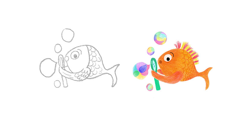
Rough
Final


Rough
Final
.jpg)
.jpg)
Rough
Final
Final Outcome

Oil Pastels
Illustration Credits: Uttara Garg

Wax Crayons
Illustration Credits: Uttara Garg

Art Safari
Illustration Credits: Tarika Jain
Oil Pastels
Illustration Credits: Uttara Garg
1/11
This project reinforced the value of user-centered design, proving that even minor adjustments like rethinking visual hierarchy and tweaks in the artwork can impact brand perception and purchasing behavior. By grounding our design in research, we created a solution that aligns with both emotional and functional decision-making factors.


bottom of page